Fire Gallery
Responsive website redesign project
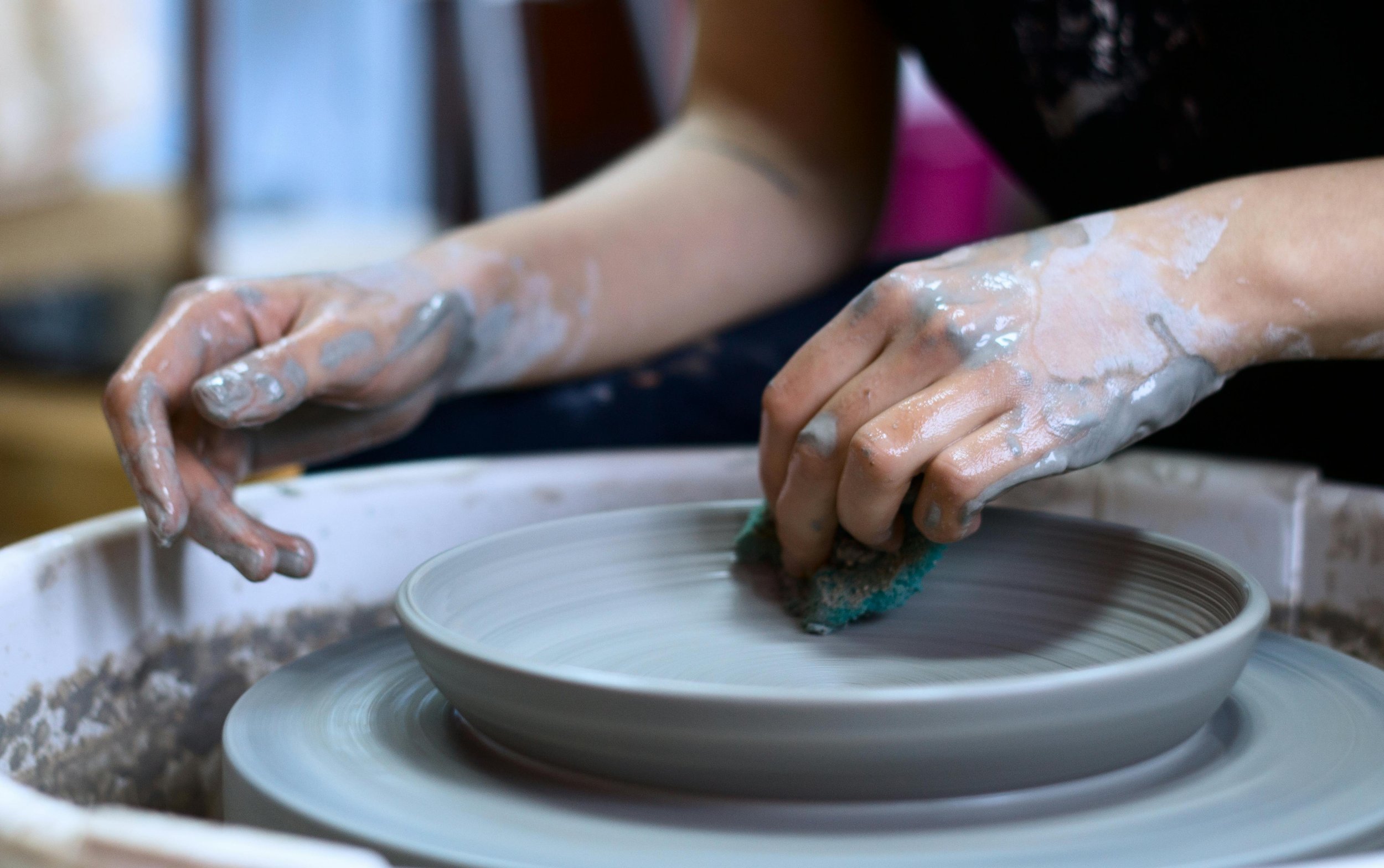
I worked closely with the owner of Fire Gallery, a local pottery studio in Houston, improve user navigation, site accessibility, and the site’s aesthetics.
Before
After
Duration
80 hours
Tools
Figma, Maze, Otter.ai
Skills
User Research, Typography, Layout & Grid Systems, Wireframing, Prototyping, User Testing
Problem
Overwhelming design and missing key information
Through user research and usability testing, I identified key issues with the current site, including complicated navigation, insufficient information about services, and an overall overwhelming design for users.
Solution
Improve navigation and online presence
I redesigned the site to be accessible, user-friendly, and visually appealing by conducting competitive analysis, creating wireframes and prototypes, and leveraging insights from user research. I then confirmed my designs with usability testing.
Old Design:
Research
Competitive analysis
Competitive analysis research was used to scope out the different pottery studios in Houston. This was helpful in understanding the current market, and any opportunities for the site.
Opportunities
Each studio had an overall professional website with easy access to information. However, there were some weaknesses among the competitors that gave way for opportunities for Fire Gallery:
Some competitors seemed corporate and contrasted Fire Gallery’s down to earth, independent vibe.
Not all competitors had accessible websites
Not many competitors had general information for beginners
Not all competitors offered courses in addition to classes
User interviews
Questions I wanted to answer in my interviews:
Identity pain points of the visitors using the current site.
Are first time visitors of the site getting the information they need regarding classes offered, memberships, etc.?
User feedback themes
Overwhelming Design
All participants (4/4) mentioned concerns about overwhelming design and the need for better organization and consistency.
Unclear Navigation
Participants had difficulty finding the list of available classes and memberships using the navigation. (3 out of 4 participants)
More info regarding classes and memberships
3 out of 4 participants noted needed more information regarding classes, memberships and/or scheduling
Inconsistency and errors
3 out of 4 participants cited errors on the site such as text written twice, inaccurate links, and other errors.
Given this new information, I decided that since most of the user’s pain points were about difficulty finding information and navigating, I would focus my redesign primarily on establishing:
Clear navigation
More consistency and organization throughout the site
More available and clear information regarding classes and memberships
Define
Personas
Jocelyn is a persona created from the interviews and competitive research that reflects the needs of a pottery class first timer and a working professional who is short on time and needs to find relevant information quickly.
Sitemap
A sitemap overhaul was essential, as usability testing revealed grammar mistakes and confusing navigation (3 out of 4 testers noted navigation issues). Improvements included consolidating menu links and pages to enhance clarity. View the full before-and-after changes in the Figma file.
Develop
Mid-fidelity wireframes
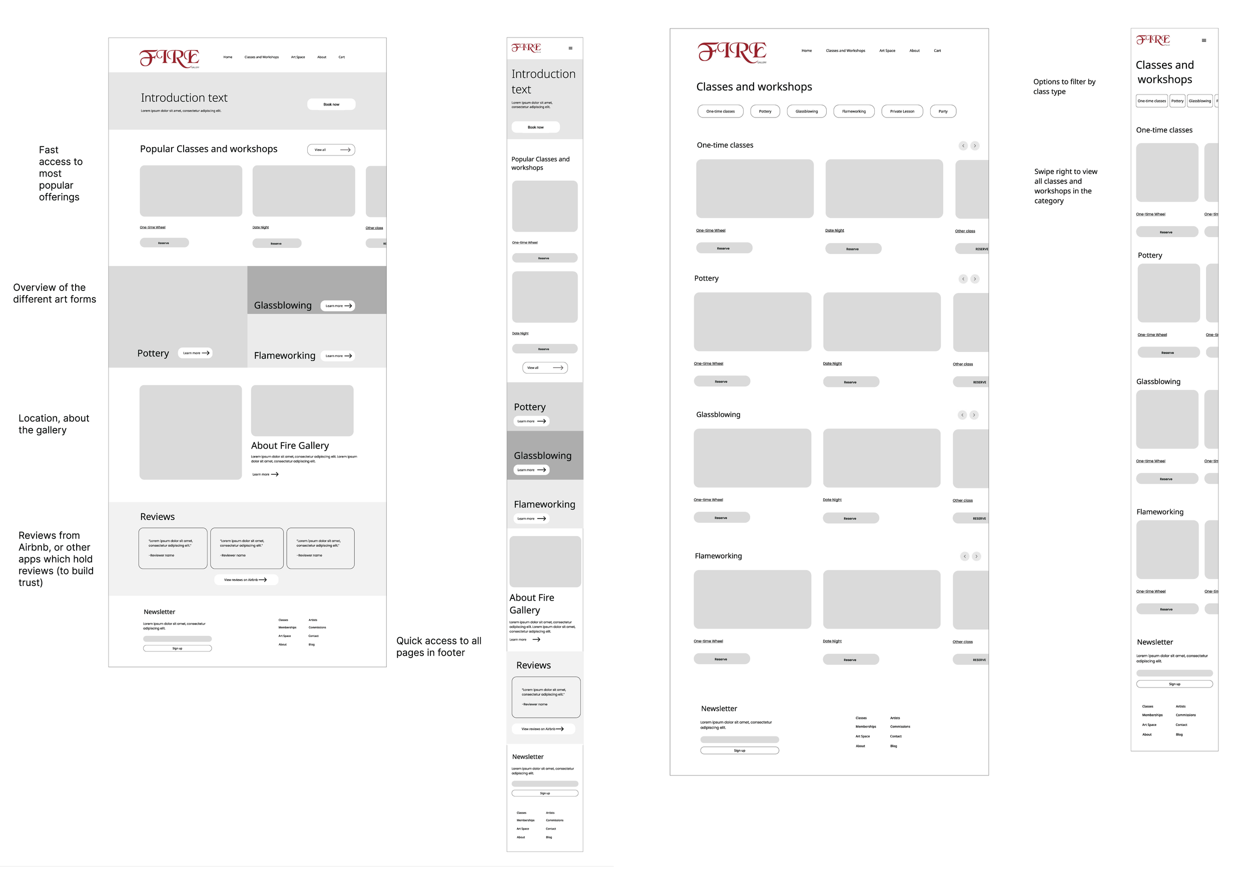
I created low/mid fidelity wireframes which included screens for a home page, classes page, and class detail page to focus on the basic layout and content placement for visitors who need information fast and simple.
Visual Design and Inspiration
Here is the inspiration for the UI elements. I loved the playfulness of these components, as they reflect the pottery studio's unique personality and the owner’s sense of fun.
Graphic I created using a stock image and photoshop to use on the site’s hero image to attract users.
High-fidelity wireframes and prototype
After creating my mid-fi wireframes, I met with the pottery studio owner, LeRoy, and listened to his feedback. He was very happy with the designs, and I went ahead and created the hi-fi wireframes shown below.
Develop
Live Test Site
Final thoughts
I really enjoyed working with the studio owner to capture the studio’s and reflecting it’s charm on the website. It was great talking to the instructors and getting feedback on how they felt about the current site. I stepped out of my comfort zone and got more comfortable communicating my designs and progress with stakeholders. I feel more confident and am happy I was able to help a local business while getting hands-on experience with design and implementation in WordPress.
One of the highlights was visiting the studio to capture photos for the website, replacing the stock images with authentic visuals. I truly loved this project and am proud of how it turned out!


