Rice University Website Redesign
UX/UI DESIGN
UX RESEARCH
This redesign for the department of Digital Accessibility supports Rice University's mission to make all digital content accessible, offering the campus essential training and resources to create more inclusive online experiences.
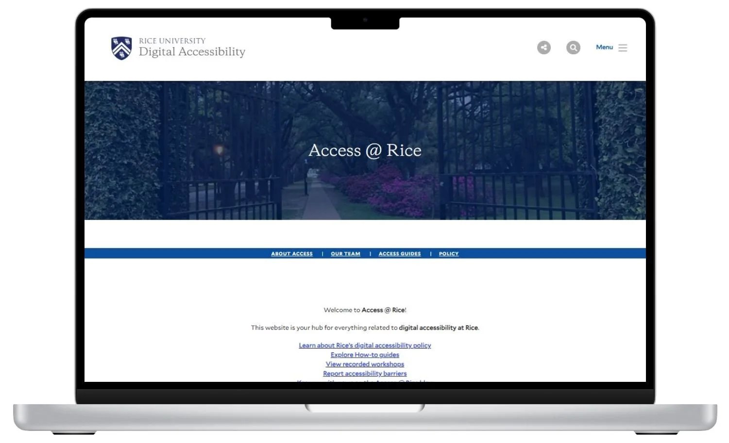
Before
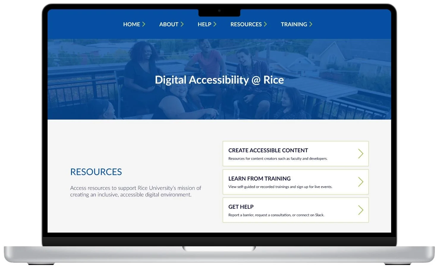
After
Problem
Through research and usability testing, I identified key issues with the current site, including complicated navigation, inaccessible content for users with disabilities, and a lack of organization of learning materials for users.
Solution
I conducted card sorting to guide the navigation redesign and collaborated closely with Rice's digital accessibility coordinator to structure the site for hosting learning materials, upcoming trainings, and other content. By incorporating WCAG guidelines and resolving accessibility issues, I ensured the site was inclusive and easy to navigate.
Duration
3 months
Tools
Figma, Maze, Drupal, Optimal Workshop
Skills
User Research, Digital Accessibility Guidelines (WCAG 2.2), Wireframing, Prototyping, User Testing
Research & Define
Before beginning any design work, I familiarized myself with the site. I then had a project kick-off call with the Digital Accessibility Coordinator, with whom I would be working closely. During this call, we discussed the site's users, its purpose, and any existing concerns or issues that needed attention. After learning that the site would primarily serve Rice users for browsing guides and reporting issues, I decided to conduct a closed card sort exercise to gauge how well users would be able to navigate on the site given the current site structure.
User Flows
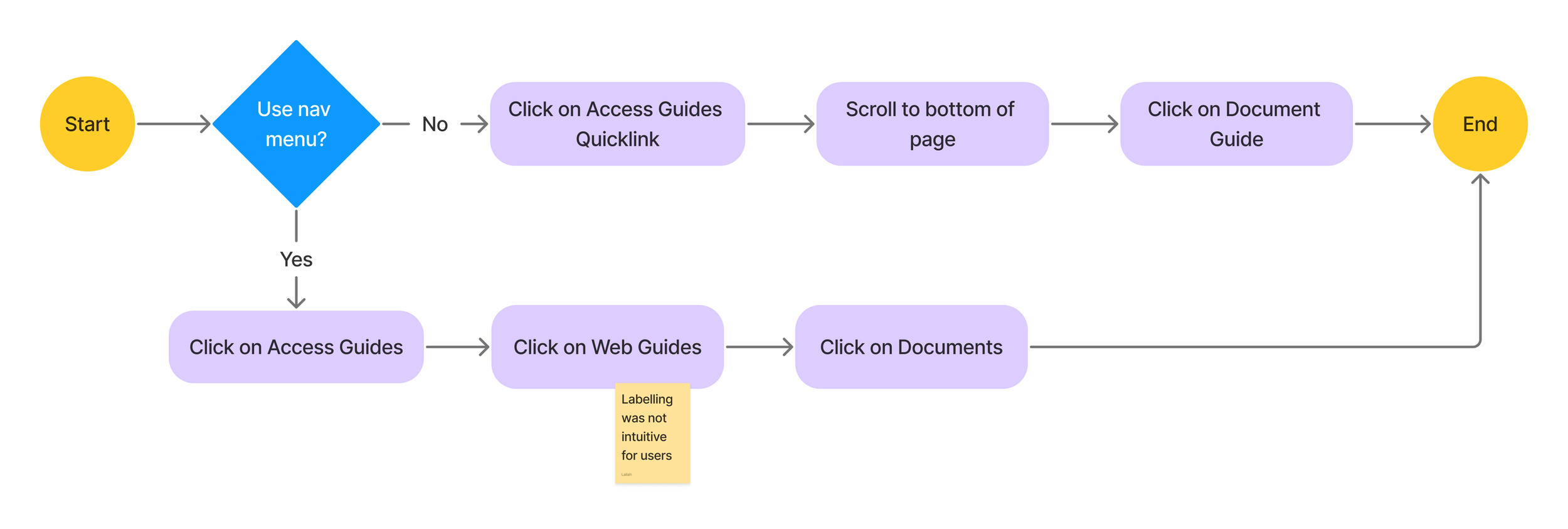
After kicking off the project, I identified the most important user flows, or most frequent tasks of the site, to identify it’s current flow and room for improvement
User flow 1 - User Reports Digital Accessibility Issue
User flow 2 - Navigate to guides for creating accessible documents
Card Sorting
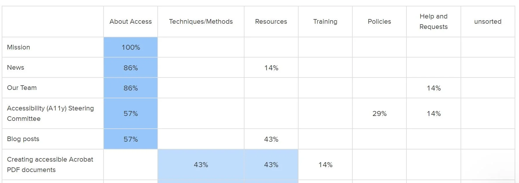
I conducted a closed card sort, recruiting seven faculty and staff participants through the campus-wide Slack channel.
The results below show the percentage of participants who sorted each card into the provided categories, (which were derived from the current site) highlighting the most popular choices.
The results were quite interesting, I was able to tell which pages were difficult for users to place in a category based on pages with multiple highlighted choices, which told me which pages users would have trouble finding on the site.
Site map
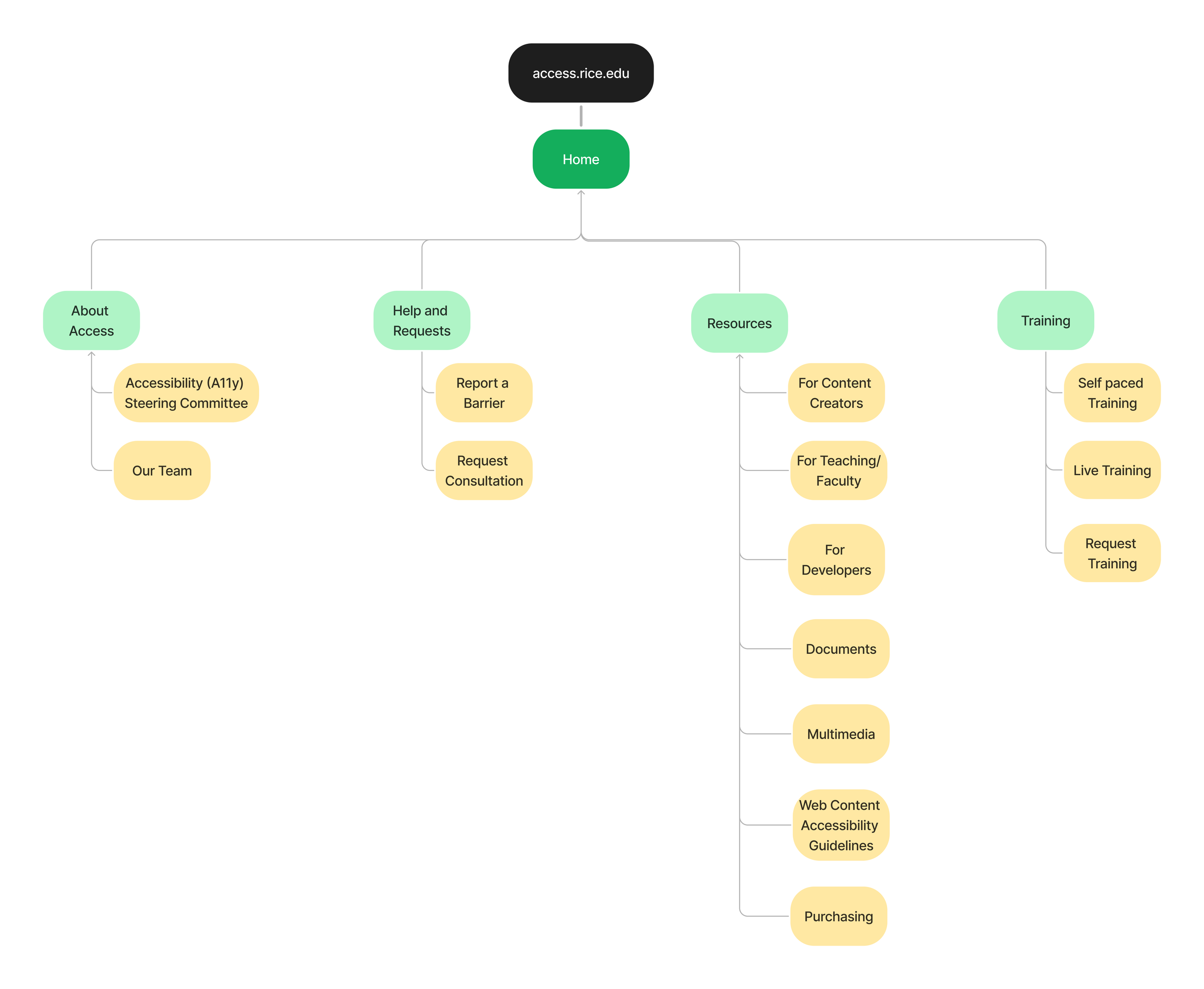
After completing the card sort, I created a site map for the design of the site, incorporating the card sort results as well as feedback from the digital accessibility coordinator. One big change was removing the ‘Techniques/Methods’ category from the card sort, and placing all resources and techniques under ‘Resources’.
To view all collaboration and before and after, view the full figma file here.
Personas
Jose, a staff member, needs to maintain public facing websites and ensure that diverse users, such as those who use keyboards, screen readers, and other assistive technologies can still access the sites.
Sarah, a faculty member, requires a platform to upload class materials like Word documents and PDFs while ensuring that her content is accessible to students with disabilities.
I developed two personas to represent the diverse needs of the site's users. Through working closely with the digital accessibility coordinator, I learned about different disabilities users might have who would need to access the site.
Develop
Style Guide
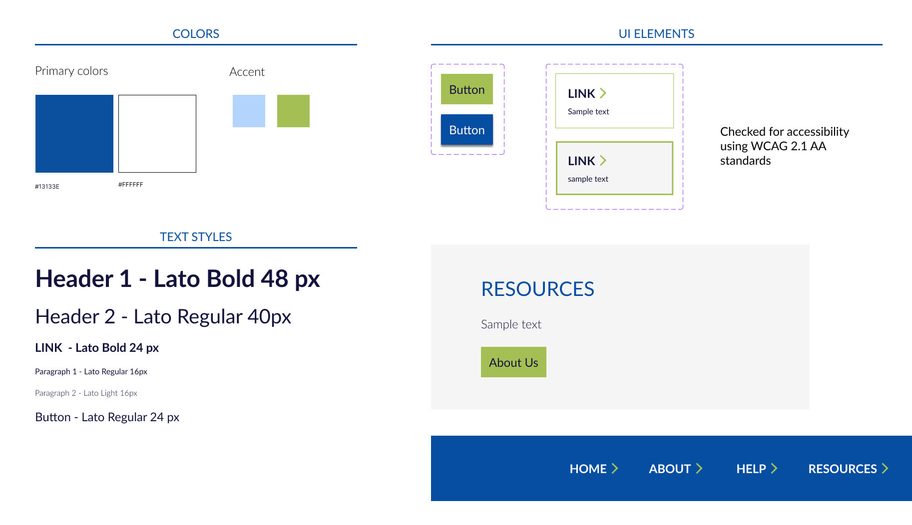
Using the official Rice colors as a guide, and the main rice.edu website, I created a style guide in Figma using the approved Rice University colors and Text styles, while ensuring UI elements that were accessible.
Hi-Fi Wireframes
The landing page was redesigned to focus on providing the most vital information first, such as the most heavily used resources by the campus.
Landing page
Simplified navigation accessible by keyboard and screen readers
Jump to the different sections of the page using the table of contents (on this page)
Quick access to upcoming events and testimonials with digging through the menu
Informational page - Resources For Developers
The informational page ‘For Developers’ is a sample page to display how pages with large amounts of sections and information are now easily organized. This is something I focused on redesigning because the majority of the site is composed of informational guides on how to make digital content accessible at Rice.
Quick access to the most popular resources
Easily discernable sections with headers and images
Test
Usability Testing and Results
To evaluate the site design and navigation, I conducted unmoderated usability tests in Maze. This approach enabled users to test on their own time navigate to specific pages and rate the ease or difficulty of finding the information available on the site. I created a guide to users on how to use the online tool maze, and specific instructions to evaluate how they would navigate the site.
I focused on questions related to the main purpose of the site:
Requesting Help for an accessibility issue
Finding online live training events
Finding online resources and guides
Usability Themes and Quotes
There was a lot of useful information collected by the usability testing tool Maze, but some key themes were identified:
Themes
Clarity of Navigation and Labels
Some testers were unsure about the “Report a Barrier” text for the link to report an accessibility issue.
Some testers (4) were uncertain about finding live training sessions and did not expect them to be located under the "Training" tab.
Issues with Maze software
30 testers
A mix of both student teaching assistants and Staff
4.2/5 ★★★★
Average rating from participants on how easy it was to find the page that lists upcoming live training (5 being very easy, 1 being very difficult).
4.4/5 ★★★★
Average rating from participants on how easy it was to find resources and guides for creating accessible documents on the site (5 being very easy, 1 being very difficult).
Priority Revisions
3.4/5 ★★★
Average rating from participants on how easy it was to navigate to report a digital accessibility issue
Report a Digital Accessibility Issue
Training and Events
Based on the lower average ratings, user feedback, and analysis of click paths, it became clear that participants were confused by the labels "Report a Barrier" and “Training.” These labels could benefit from being more descriptive and intuitive to better align with users' expectations.
Changed navigation labels:
Report a Barrier
Training
A few users mentioned minor issues, like the need to scroll to find information or encountering glitches during screen sharing (2 testers)
➜
➜
Remediating Accessibility Issues
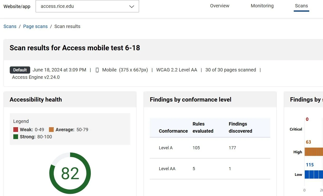
I worked on accessibility issues by identifying them using web tools like WAVE (a browser extension) and LEVEL ACCESS, a paid product used by the Digital Accessibility Department. In this role, I assisted the digital accessibility coordinator in developing a process to identify accessibility problems, acting as both a designer and developer to enhance collaboration with the team. I redesigned the navigation menu using accessible code and guidelines outlined by WCAG. I also conducted keyboard testing and resolved common issues related to keyboard navigation, screen readers, contrast, and ARIA labels.
Below is a audit of the access.rice.edu site, after identifying and resolving accessility issues.

