Trestle
A furniture resale app leveraging the capabilities of Augmented Reality (AR) to facilitate swift and efficient discovery for both sellers and buyers.
Duration
Tools
80 hours
Figma, Maze
Role
Sole product designer
Skills
Overview
Engaging in the resale of furniture is a sustainable and wallet-friendly solution. Beyond its economic benefits, this practice contributes to personal happiness by allowing individuals to express themselves, encouraging a strong sense of identity, and creating a comfortable and joyful home environment.
Main problem
Navigating furniture resale apps is like finding a needle in a haystack, akin to challenges faced in traditional used item shopping. It's hard to find specific styles, and communication issues can make trusting the process difficult. My goal was to make it easier for buyers to get the info they need and help sellers share that info easily, all while building trust for smoother transactions.
Research
Research goals
Analyze features in competing products and find opportunities to better serve users
Understand how are people buying/selling used furniture currently
What is the process like to find furniture users like? What apps or features are used?
What works/doesn’t work for people buying/selling used furniture currently?
Methods
Competitive analysis
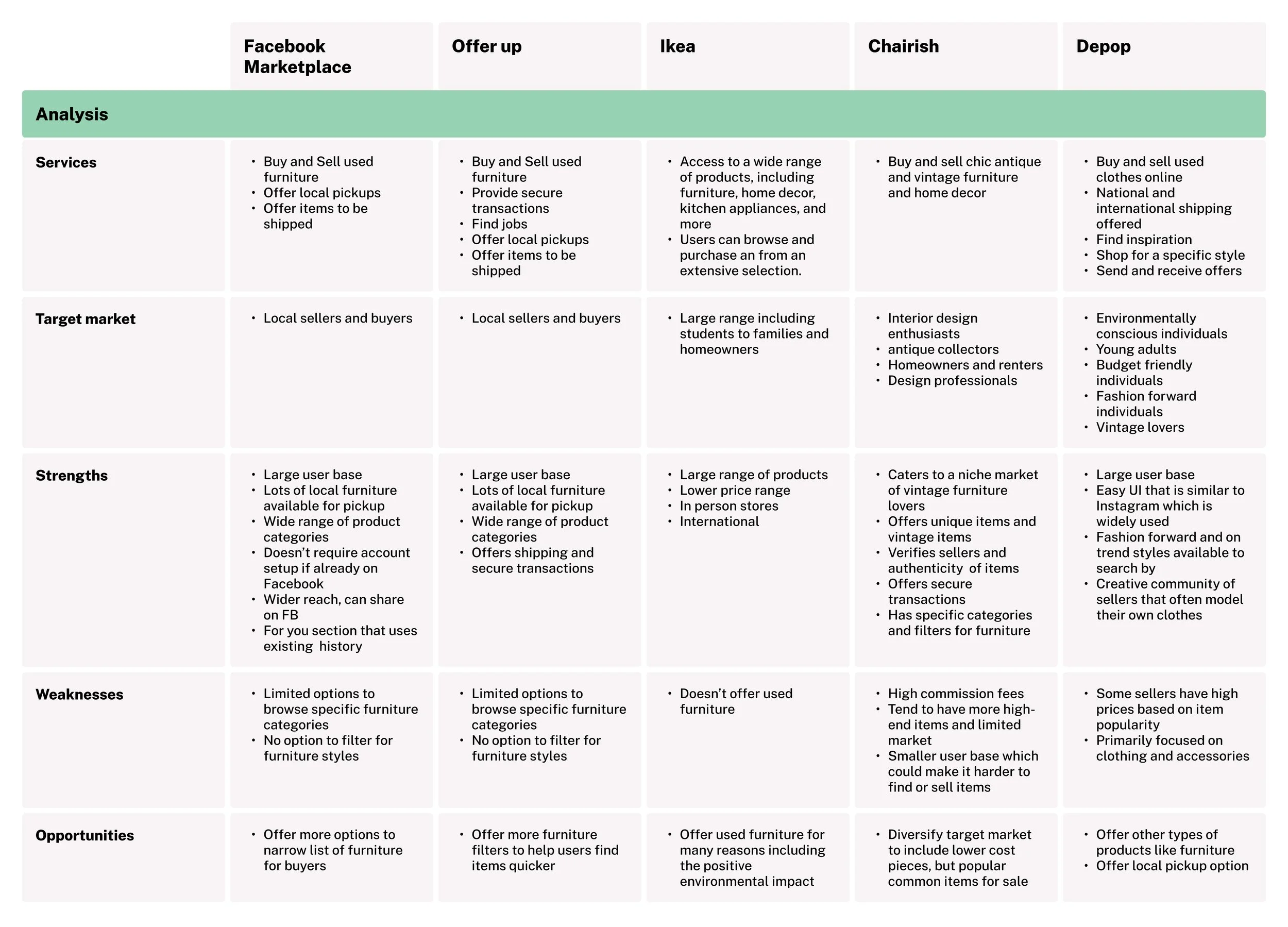
I conducted a competitive analysis to analyze 5 apps currently on the market that offer furniture resale and other resale services. I completed a SWOT analysis along with a comparison of the features to gauge what the current market offers.
From my research, I concluded that there was not a widely used economic-friendly and trend-friendly tool that can easily help buyers find what they need quickly.
User interview themes and quotes
I conducted 4 virtual user interviews on google meet. View user interview themes in an affinity map here.
100%
of participants have used furniture resell apps
Difficulty Searching
100% of participants mentioned having difficulty on the process of searching or trying to find an item
Pinterest and Inspiration
100% of participants mentioned they enjoy using Pinterest for inspiration
Quick communication
75% of participants mentioned favoring short and quick messaging when selling and buying items
Need detailed photos
75% of participants mentioned needing clear photos of items before purchasing to verify damage and other details
Browse by Style
100% of participants mentioned they currently seek out specific styles such as “mid century modern” for example.
Define
To kickstart the design process, I initiated brainstorming sessions to generate "How Might We" questions, fostering an environment to explore potential solutions for someone like Audrey. Following this, a MOSCOW analysis (Must-haves, Should-haves, Could-haves, Won't-haves) was conducted to prioritize features and functionalities based on their criticality, ensuring a clear roadmap for development and design decisions.
Personas
Audrey’s persona is a result of the feedback gained from interviews with participants who mostly live in large cities with common pain points including difficulty looking for specific items and cumbersome messaging back and forth with sellers for more information.
How Might We’s
How might we make it easier for buyers to find specific furniture items?
How might we enable buyers to discover items and inspiration that align with their own preferences?
How might we make the interaction between buyers and sellers as short and efficient as possible when agreeing on price, transportation and payment of items?
How might we make buyers more confident about the furniture item they are considering purchasing?
MoSCoW analysis
User flows
User Flow 1 - Search for an item with a specific style
This flow demonstrates how a user would be able to find an item with a specific style in multiple simple ways.
User Flow 2 - Seller lists an item to sell using Augmented Reality (AR).
The second flow displays how no detail will go unmissed by the seller, eliminating the need to go back and forth between buyers and sellers on images and other details. It also streamlines the uploading process for the seller by quickly listing items while helping to accurately categorizing items to be searched. This idea was spurred by looking at my MoSCow analysis and noticing the AR feature and detailed item information listed.
Brand style tile
I decided on the word “Trestle” for the app name which is an older English word for a framework consisting of a horizontal beam supported by two pairs of sloping legs, used in pairs to support a flat surface such as a tabletop. I liked this word because it represents something timeless and built to last.
I created the Logo using the font called Crimson Text and turning the word into a vector then rounding the corners to a radius of 6. I also applied a roof to the logo to symbolize a home.
Develop
Sketches/lo-fi wireframes
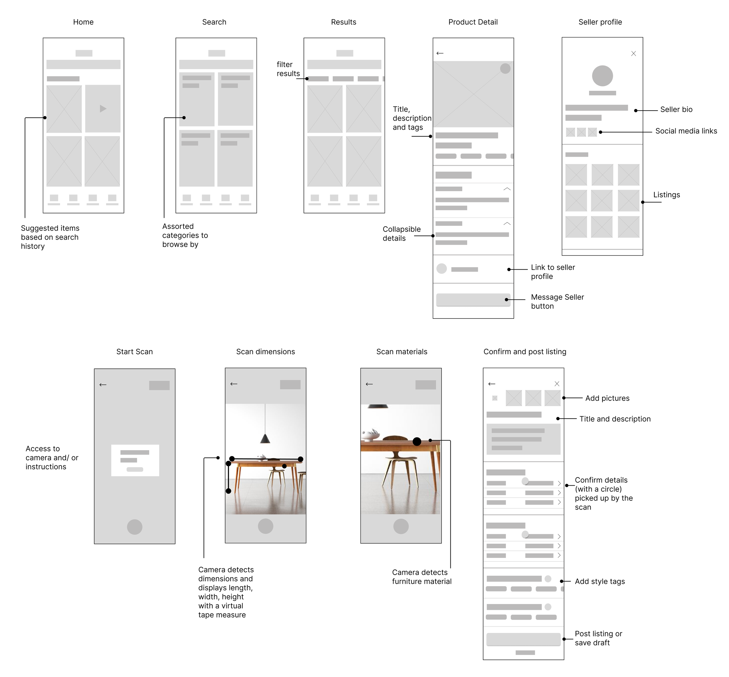
I sketched some screens that promote exploring but also allows a user to find something specific, and a detailed product listing page so users have the information they need regarding a piece of furniture.
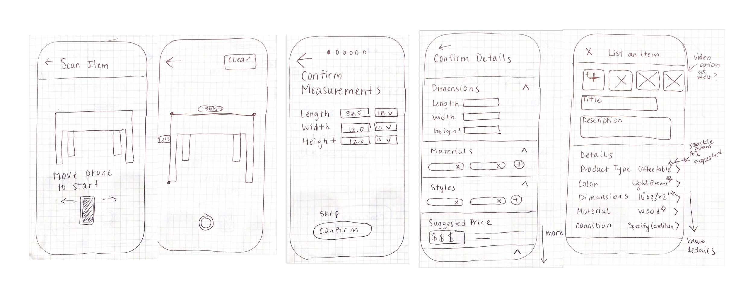
These screens were sketched for the process to upload an item using AR. For the inspiration, I looked upon apps which use AR such as Apple’s measure app, Target’s shopping app, and an even online eyeglass store that allows you to try on glasses!
Mid-fi wireframes
These wireframes iterate on the screens I sketched.
UI components
I created interactive and clickable components in Figma that were used in my final prototypes. Creating components for scanning an item using Augmented Reality was a challenge, but was the most rewarding. Below are some of my most used components. Click here to see all components created.
High fidelity wireframes
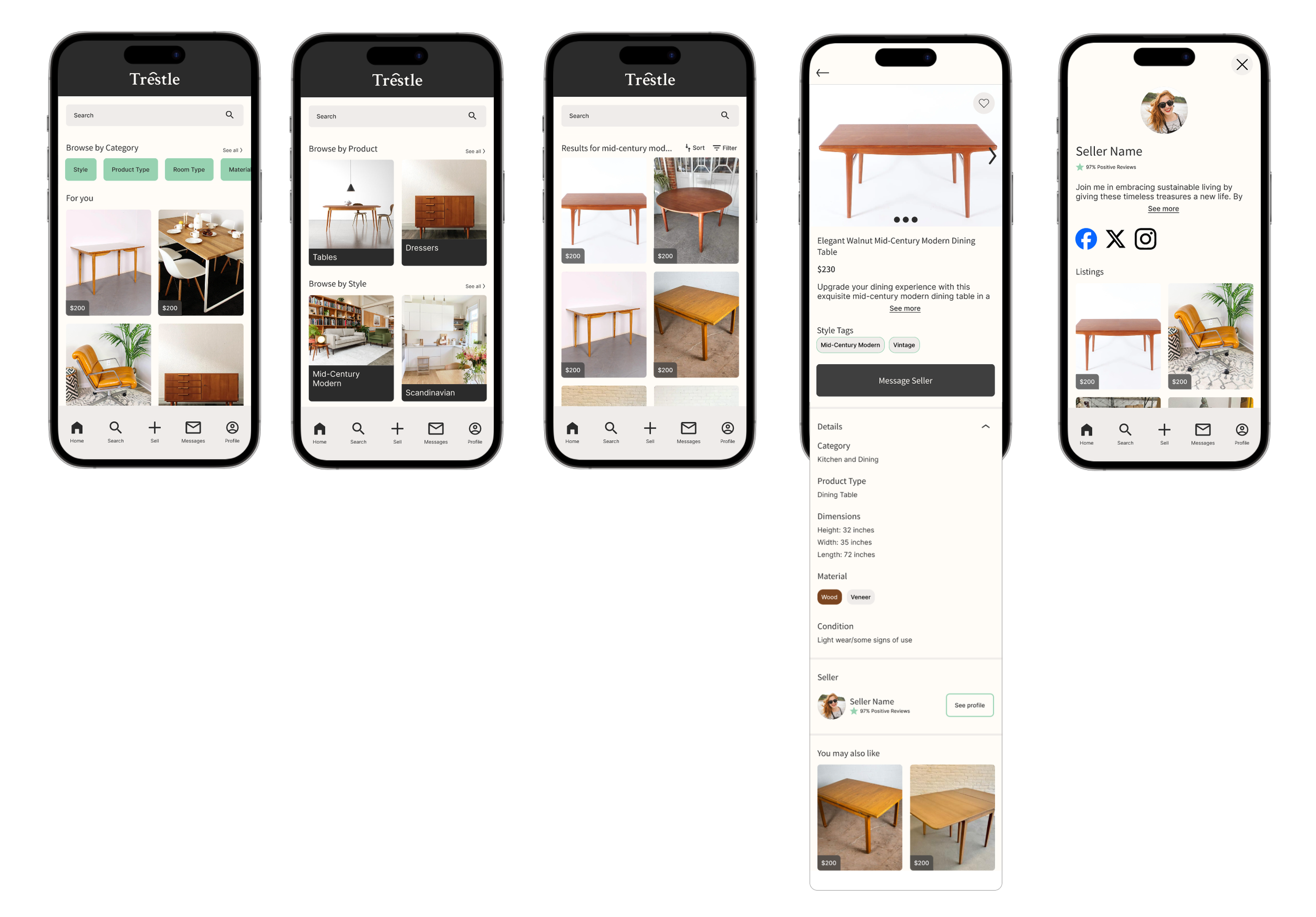
After creating all of my components, I created my high fidelity wireframes that brought all of my design elements to life.
Flow 1 - Find and view an item for sale
Flow 2 - List an item to sell using the scanning feature.
Prototype and test
Usability testing and quotes
I conducted unmoderated usability tests using Maze. View all Usability testing feedback and themes in an affinity map here.
8
Participants
3/8
Have used a furniture resale app or service
100%
Said searching for an item and viewing the item's details as “Very easy”
88%
Said it was easy to to list an item using the scanning feature
Iterations
Given the positive user feedback and absence of significant issues shown above, no iterations were deemed necessary.
Live prototype
Final thoughts
Designing for this project was an absolute delight and I’m super proud of how it turned out. The interview process provided valuable insights from users of the furniture app, enriching my understanding of how to really listen to user’s pain points to find a creative solution.
This project took me out of my comfort zone by designing for AR which I have never done before. I was surprised to find inspiration from the unexpected which would even include an online eyeglass shop which uses AR! By playing around with other apps for inspiration and keeping an open mind, I was able to come up with a realistic solution that would help a majority of users I interviewed find that perfect something for their home.
I would like to express my gratitude to my interviewers, dedicated usability testers, and my invaluable mentor, Lauren. Additionally, a special thanks to my Design Lab peers, Ari and Arianna, who helped provide valuable feedback during our virtual meetups!


