UbHer
Add a feature project
A safety feature tailored to empower women, enabling riders to make informed decisions by accessing feedback from other female users.
Duration
80 hours
Tools
Figma, Maze
Skills
User Research, Layout & Grid Systems, Wireframing, Prototyping, User Testing
Overview
Being a woman, and recognizing the unique discomforts many of us have faced, I embarked on a journey to investigate the possibility of introducing a feature that could enhance the safety and comfort of female riders using Uber.
Main problem
In a safety report by Uber published in 2022, which encompasses data from 2019 and 2020, alarming statistics were revealed. The report documented 998 cases of sexual assault in the year 2020 alone. Women constituted a significant 81% of the victims (CNN, 2022).
Victims of Uber sexual assault cases reported in 2020
With these concerning statistics in mind, it became clear that there's an urgent need to address safety concerns, particularly for female riders. To better understand the specific issues and thoughts that women have about safety while using ride-sharing services, I embarked on a series of interviews aimed at gathering valuable insights.
Research
Research goals
What are Uber riders' concerns, experiences, and pain points?
What are some methods that currently make riders feel safe?
Collect data to determine interest in a safety feature for specific rider groups.
Find opportunities to enhance the Uber rider experience through interviews or competitor analysis.
Methods
Competitive Analysis
User Interviews
Competitive analysis
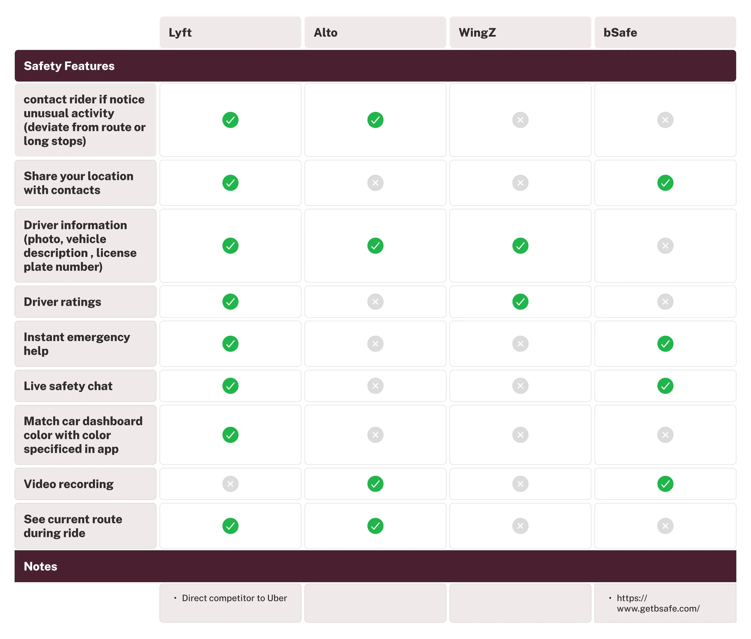
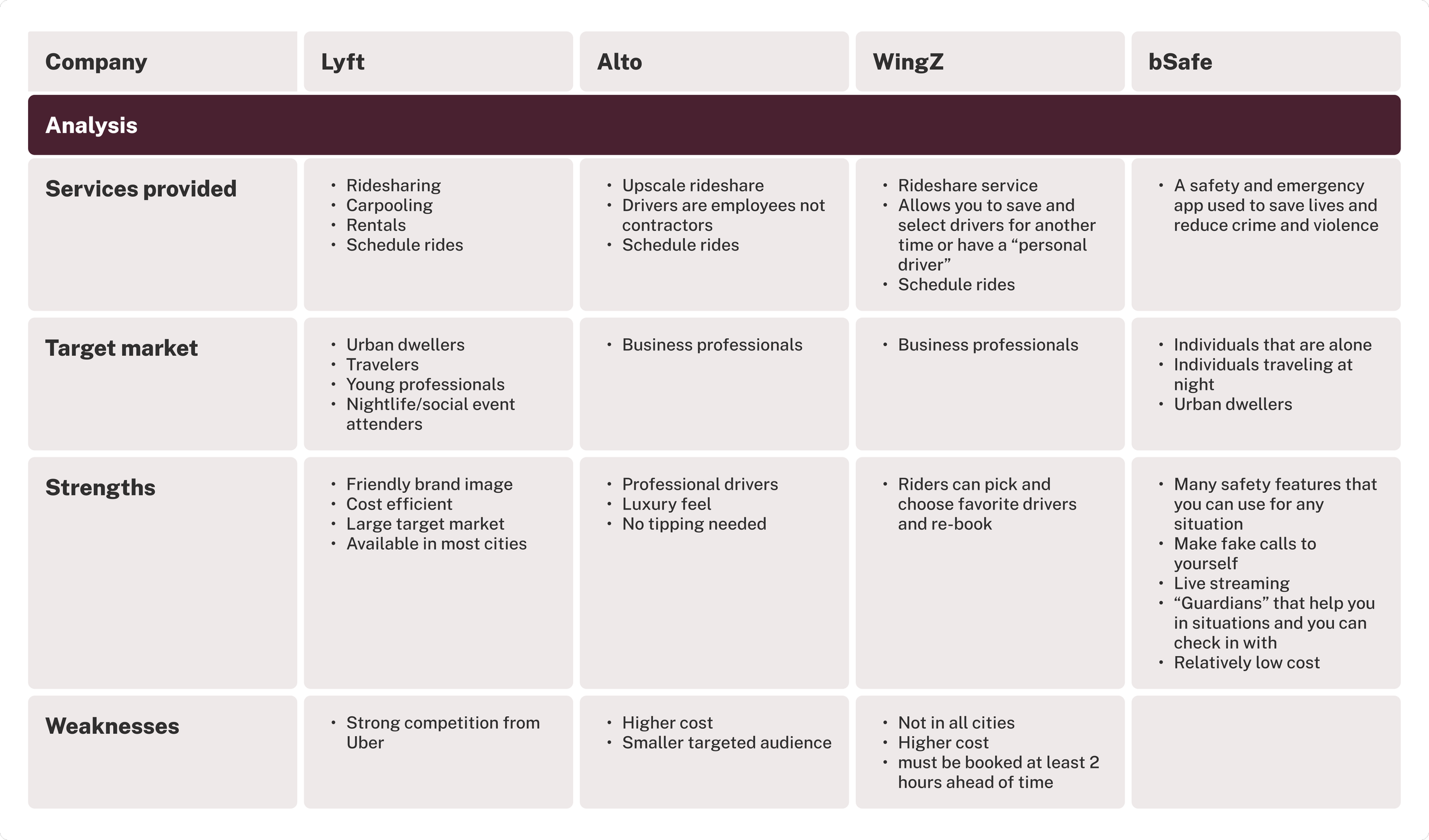
Some key takeaways from my competitive analysis was that Lyft was very similar in safety features compared to Uber and the most accessible and affordable. Another indirect competitor, bSafe, provides many additional safety features that did not exist in any other rideshare apps, that could potentially be used on an Uber ride.
User interviews
Background
Interviews conducted virtually via Google Meet
All 4 participants identified as female
Ages ranged from 24 - 30
3 out of 4 participants live in a dense city
Insights
Similar experiences among women
4 out of 4 participants had uncomfortable/unsafe experiences related to driver activity during a ride
Interest in seeing what other women are saying
4 out of 4 participants were interested in a feature that would allow them to view other women’s ratings
Similar preferred drivers
4 out of 4 participants feel more comfortable when drivers have friendly conversation and similar friendly manners
Similar methods to be safe
3 out of 4 participants engage in additional safety measures such as sharing information with family/friends to stay safe
Feature requests
2 out of 4 participants wish they could request a female driver if given the option
Key takeaways from my research
My research found that Uber, like its competitors, offers various safety features. However, despite using these features, interviewees consistently expressed discomfort and felt unsafe due to driver behavior. Particularly among women, a preference for specific drivers and trust in fellow female drivers and reviews emerged as common themes.
Define
User persona
Liz usually tries to ride with friends, but she Ubers when her friends aren’t available. She takes safety precautions such as communicating with friends and family and sharing her route. She also is wary of nighttime rides and is extra alert on most rides because of bad past Uber ride experiences.
Generating ideas
How might we enhance the overall experience for female identifying riders, taking into account their preferences, safety, and comfort during rides?
Storyboarding
I sketched out how a feature which would allow other women to choose and pick their driver might look like.
User flows and task flows
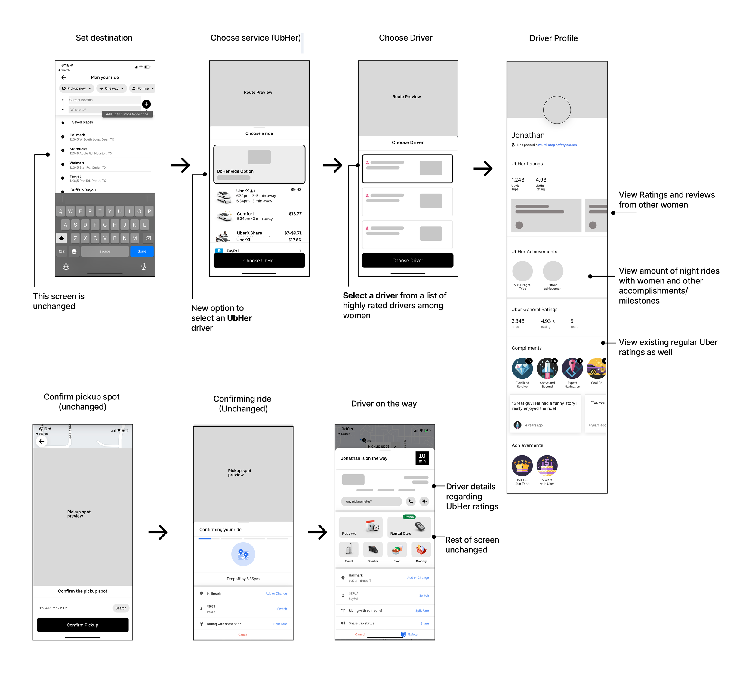
User Flow 1 - Plan, confirm and book ride.
I've maintained the existing flow as much as possible, with the added step where the rider has an option to choose and confirm the driver before the driver begins the trip. In the previous process, the driver was automatically assigned (with the option to cancel), but I believe it's more user-friendly and safer to have a confirmation screen, allowing the rider to confirm the driver and avoid the need to cancel and rebook the ride.
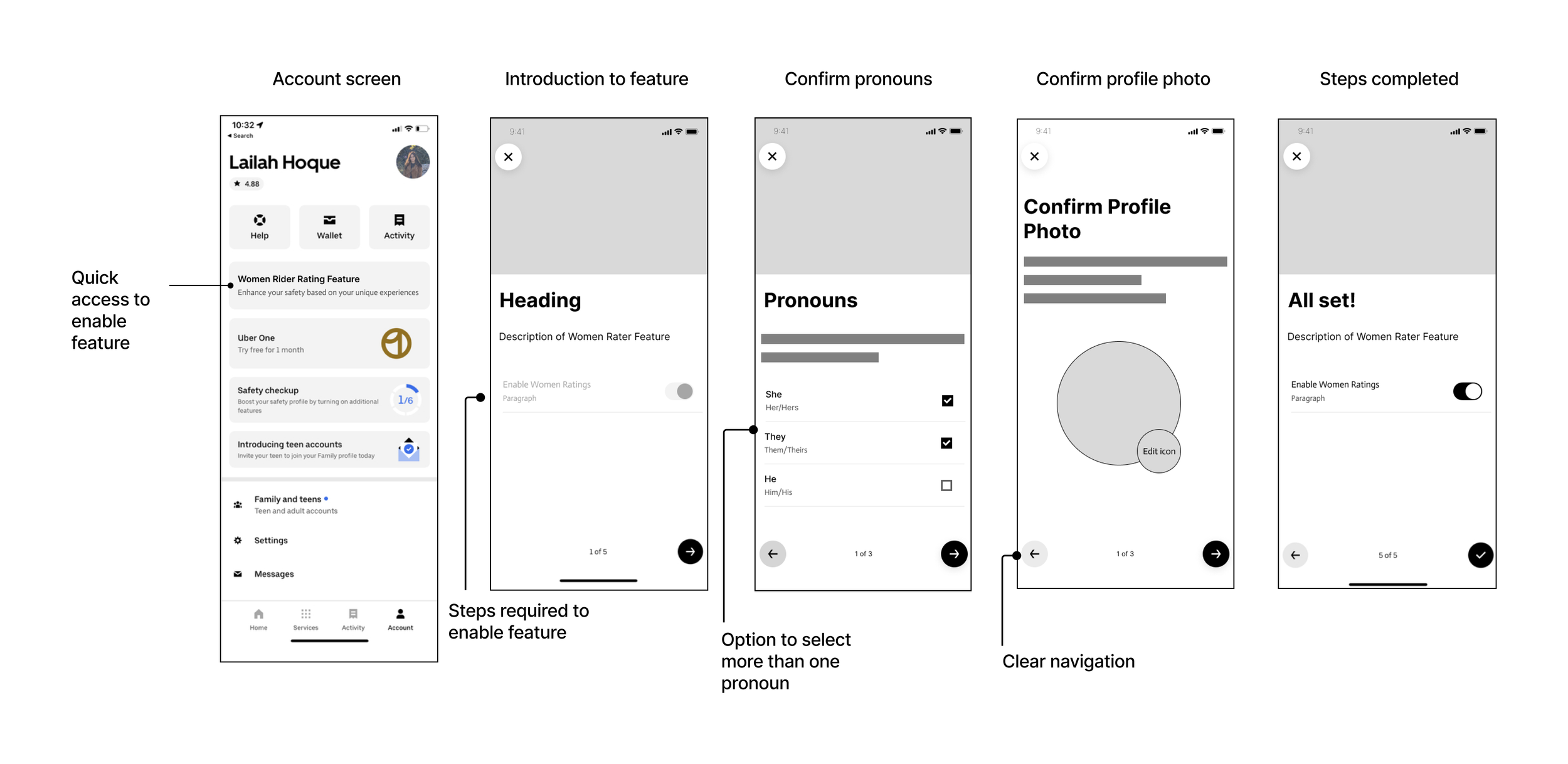
User Flow 2 - Enabling the UbHer feature
This user flow includes the process to confirm pronouns, so that other riders can can be given context of who is writing the reviews. This feature is only available for those who enable it.
Develop
Mid-fidelity wireframes
I created mid-fidelity wireframes by taking screenshots of the existing process, then added pages or elements of the new features.
Flow 1 - Enable feature
Flow 2 - Choose driver and book ride
UI components
Referencing Uber’s current Design system, Base, I recreated some components that were not included in the publicly available design file, and created new components specially made for the UbHer flows. Take a look at my components here.
High-fidelity wireframes
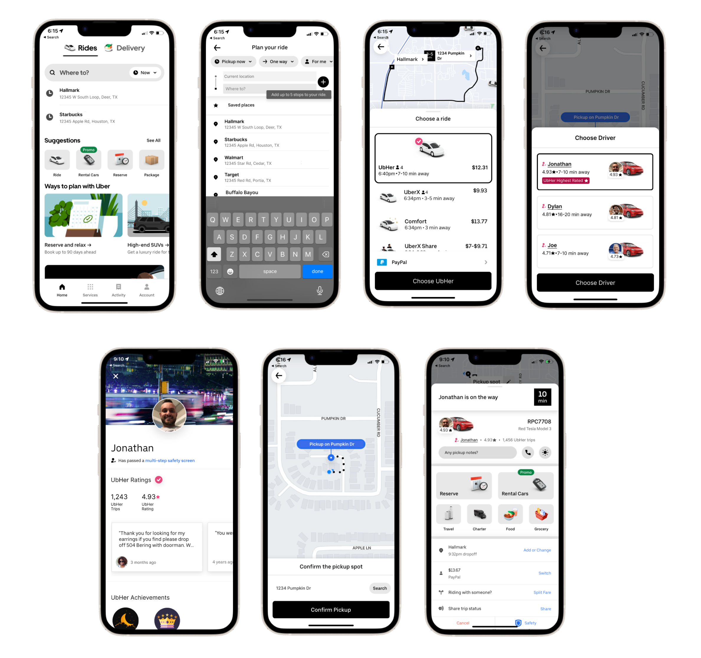
After creating all of my components, I created my high fidelity wireframes that brought all of my design elements to life.
Flow 1 - Enable the UbHer feature
Flow 2 - Plan ride and choose driver
Prototype and test
Usability testing and quotes
I conducted unmoderated usability tests using Maze. View all Usability testing feedback and themes in an affinity map here.
7
Participants
100%
Identify as women
86%
Said enabling the Ubher feature was “Very easy”
86%
Said choosing a driver and booking ride was “Very easy”
Priority revisions
Iteration - Improve screen(s) to access driver profile
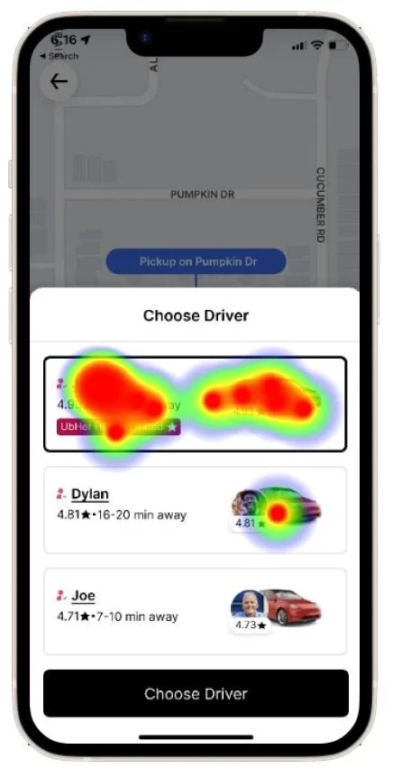
Only 50% of participants thought it was easy to look at the driver's profile and finish requesting their ride
By looking at the heatmap to see all clicks from usability testers, I saw participants were clicking the driver card instead of just their name. I increased the clickable area to access the driver profile screen to improve this rating.
Clicks from Usability Testers
Live prototype
Final thoughts
I found it satisfying in interviewing and connecting with riders to understand their safety-related thoughts and concerns. It was truly empowering to take those insights and propose a new feature that has the potential to enhance riders' sense of safety.
Working within an established design system (Base by Uber) during this process was a valuable learning experience. It boosted my confidence in tackling real-world projects that rely on existing design systems.


